
Are you old enough to remember when orange was the outcast color on the color wheel? That was the mauve-and-gray era of the ’80s that spilled over into the garden.
Orange found its way back into our graces and now has wonderful names like sunset and tangerine. The color helped pave the way for putting the festive look back into the garden. It’s great to have a wide range of colors to choose from, and a color palette that supports our favorite hues.
Flowers aren’t the only stars of the garden show. Foliage can steal the spotlight and play a tremendous role in bringing color to the garden.
Unless a garden is void of plant material, the landscape has some established colors to keep in mind as you choose your spring colors to blend with trees, bulbs, and perennials. The easiest way to choose your colors is to keep pastels with pastels, and brilliant colors with the jewel tones. When doing so, you can easily mix or match any color to your palette within those parameters. Mixing pastels with jewel tones needs a bolder move. A blushing pink might fade out next to a fire engine red. Yet for those with a keen eye and rebellious spirit, color rules are simply invitations to invent new harmonies.
Christina Salwitz is a garden designer for Personal Garden Coach and author of three books, including the forthcoming The Bold Container Garden (Cool Springs Press), out in 2027. “Forget the safe, green-and-white shade garden,” she said.
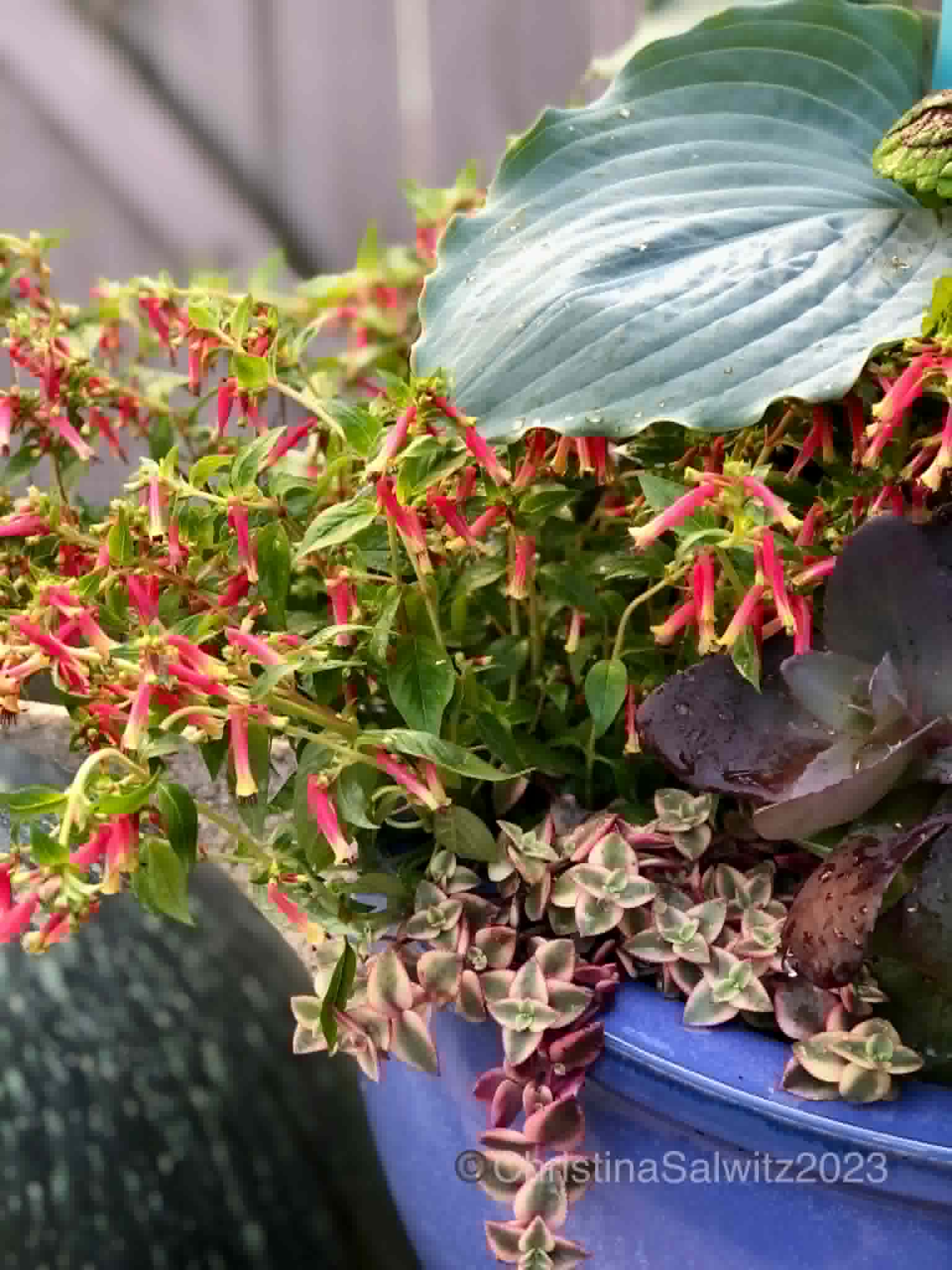
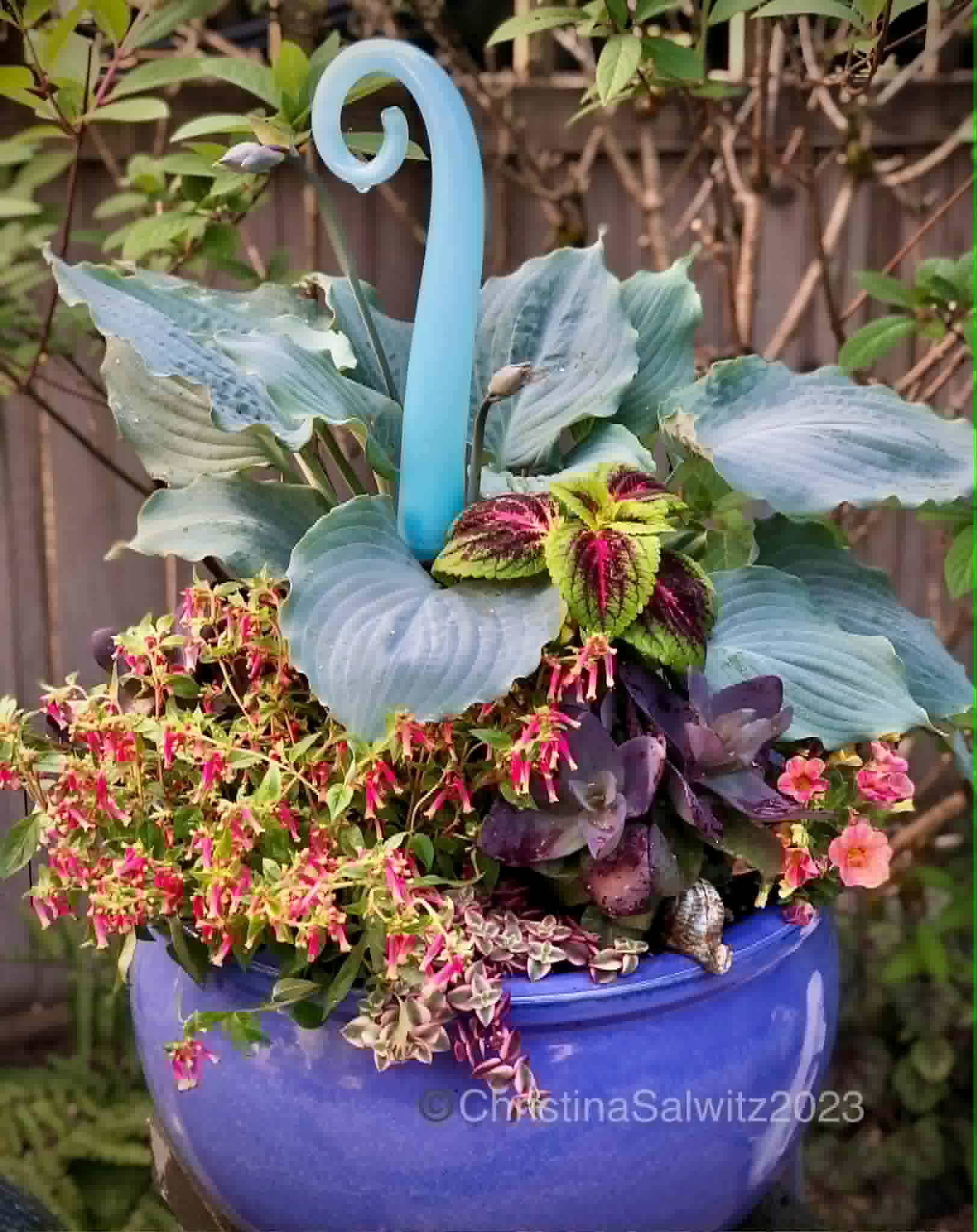
In a blue pot, she planted what she calls a high-voltage combination. “I used the oversized, glaucous blue leaves of Hosta ‘Diamond Lake’ as a structural anchor for a magenta party,” she said. “By weaving in the neon-flecked Coleus ‘Ruby Rose’ and trailing ‘Calico Kitten’ Crassula, the container feels architectural rather than just ‘planted.’ The intense periwinkle-blue pot and the harmonic pale-blue glass art turn a shady Pacific Northwest corner into a deliberate, high-contrast masterpiece. The slug-resistant blue Hosta is a low-maintenance bonus!”
Some plants already have their own built-in color palettes. Variegated foliage, featuring three or more colors in leaves and flowers, visually provides an instant palette. Foliage in hues other than green, hold flowers that stand out in complementary or contrasting colors.
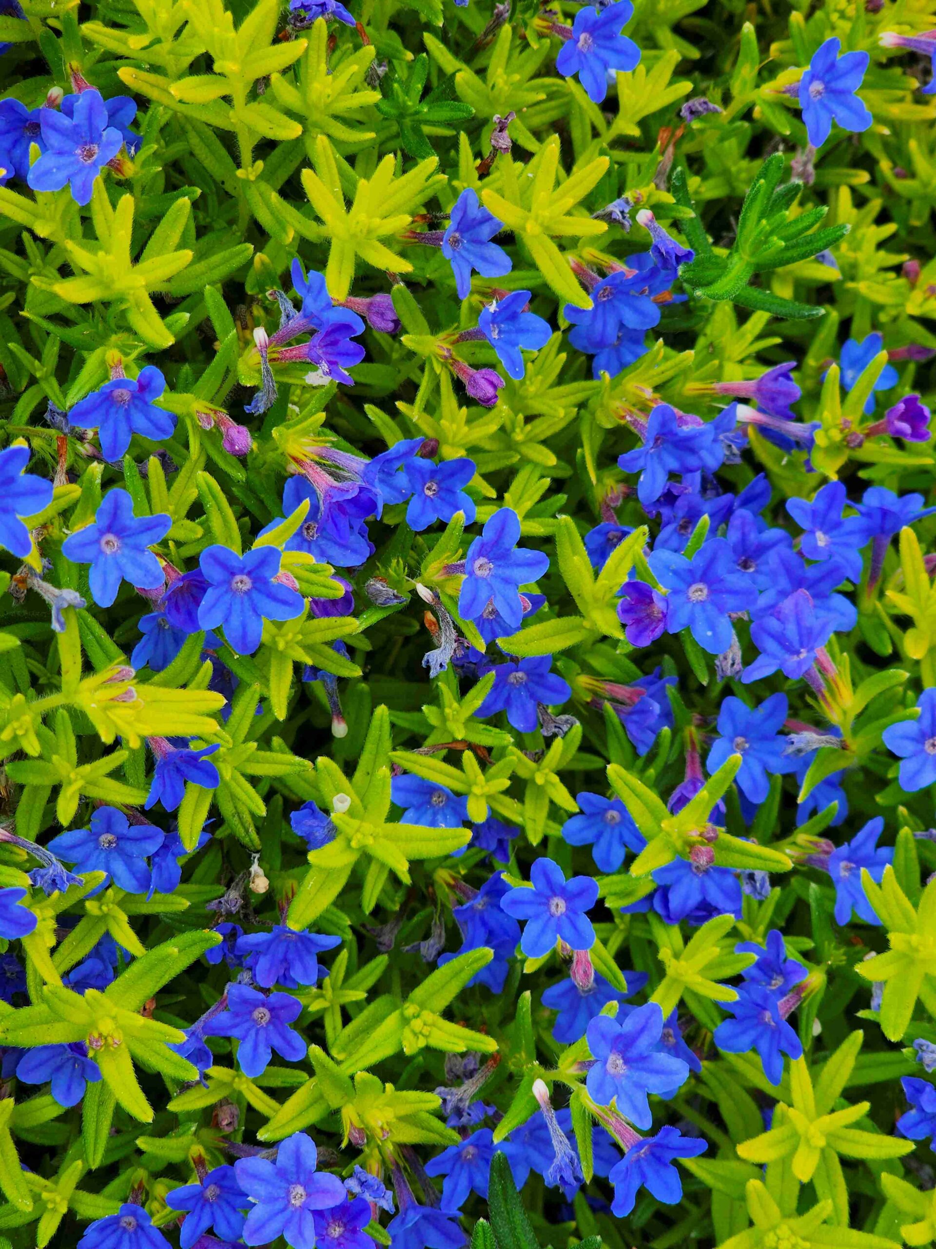
Lithodora diffusa ‘Gold n Sapphires’ is one such example. Its chartreuse foliage glows next to the deep blue flowers. It’s a winning color combination whenever you can find it. With afternoon shade, the foliage keeps its color better and is an outstanding show off, draping down a wall or raised bed.
Anytime you can add deep blue to your garden palette is a bonus.
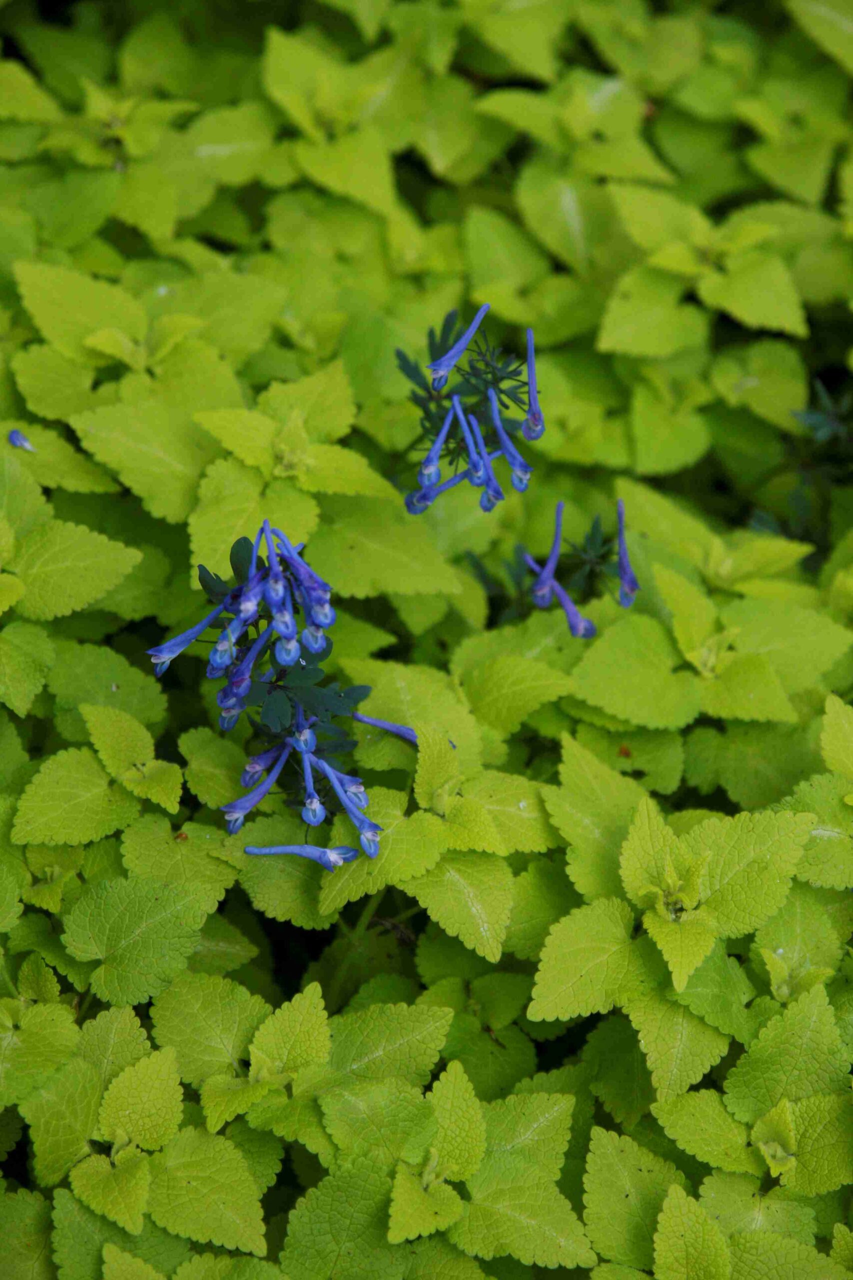
Pairing Lamium maculatum ‘Aureum’ (golden dead nettle) with Corydalis ‘Blue Panda’ brings that same effect to shadier corners. The Corydalis peeks up through the Lamium foliage, sometimes with Lamium’s lavender-purple flowers. The downside to growing them together is keeping the golden foliage from overtaking the Corydalis.
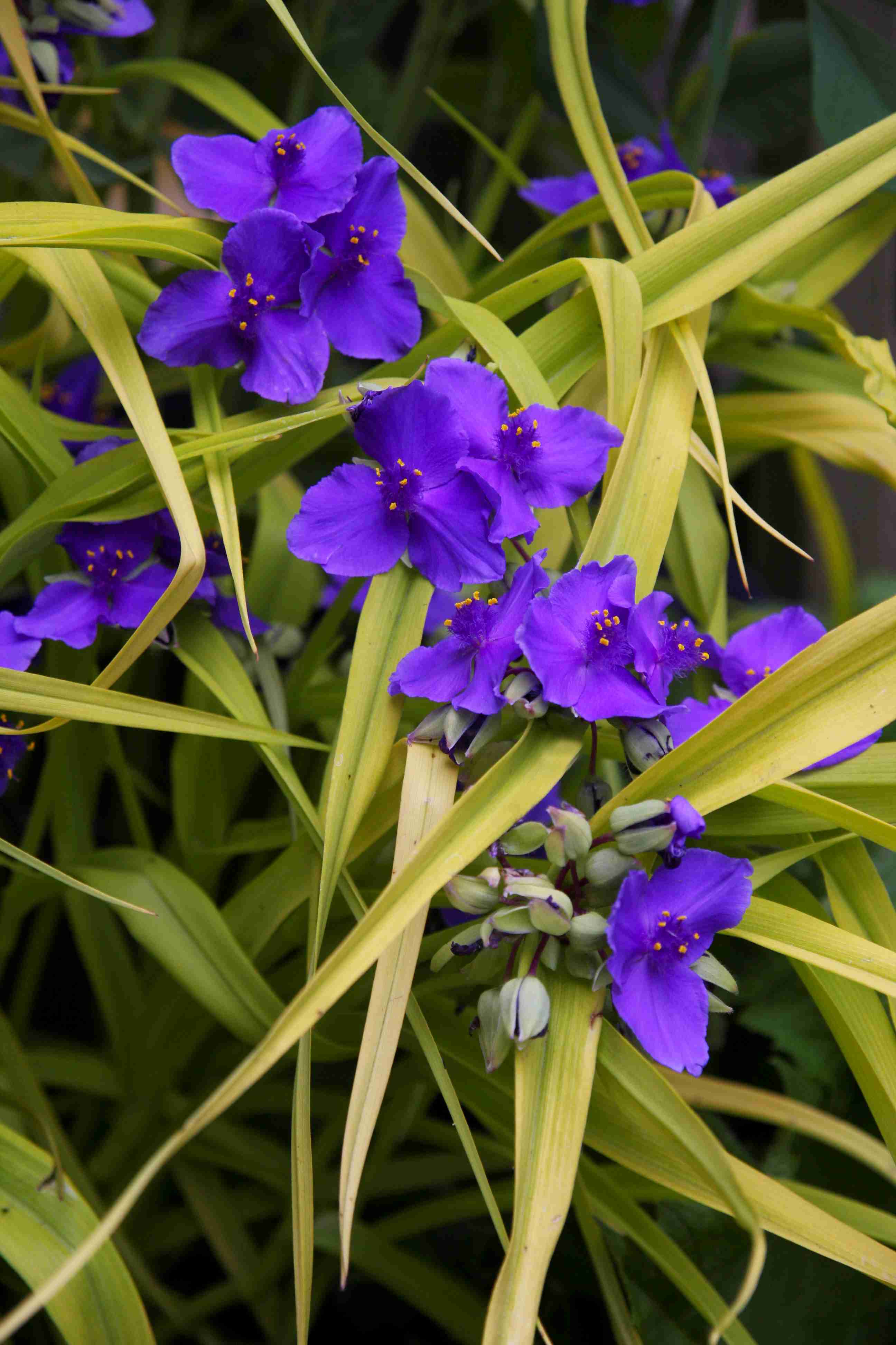
Tradescantia ‘Sweet Kate’ is a perennial with soft chartreuse to golden foliage and rich purple flowers. The gold, narrow leaves send the flowers to the center stage. Although it’s hard to tell which one’s the star of the show, because contrasting colors always put on a winning performance.
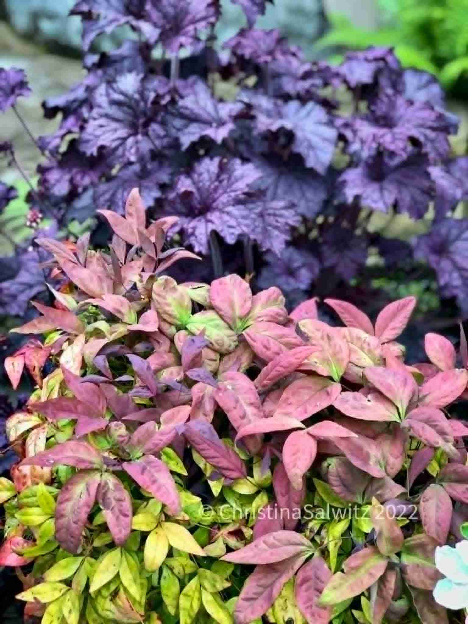
Salwitz, well-known for her extensive use of foliage in her garden designs, likes to put a tonal twist on spring plantings. “This combination trades bright blooms for richly layered foliage. Soft blush and muted green in Nandina ‘Blush Pink’ echo and diffuse the saturated, oversized leaves of Heuchera ‘Grande Amethyst,’ creating a painterly blend that feels both unexpected and sophisticated.”
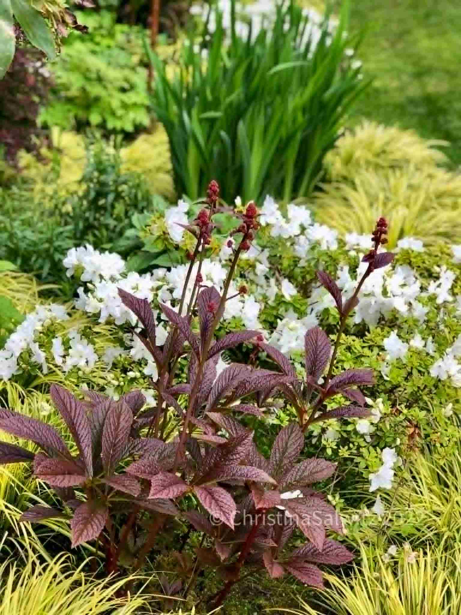
“This fresh pairing leans into contrast without feeling loud — deep burgundy foliage of Rodgersia ‘Peacock’ pops against soft white azaleas, while ribbons of golden Acorus weave light through the composition. The effect is layered and luminous, with the upright iris foliage in the background adding a quiet structural backbone.”
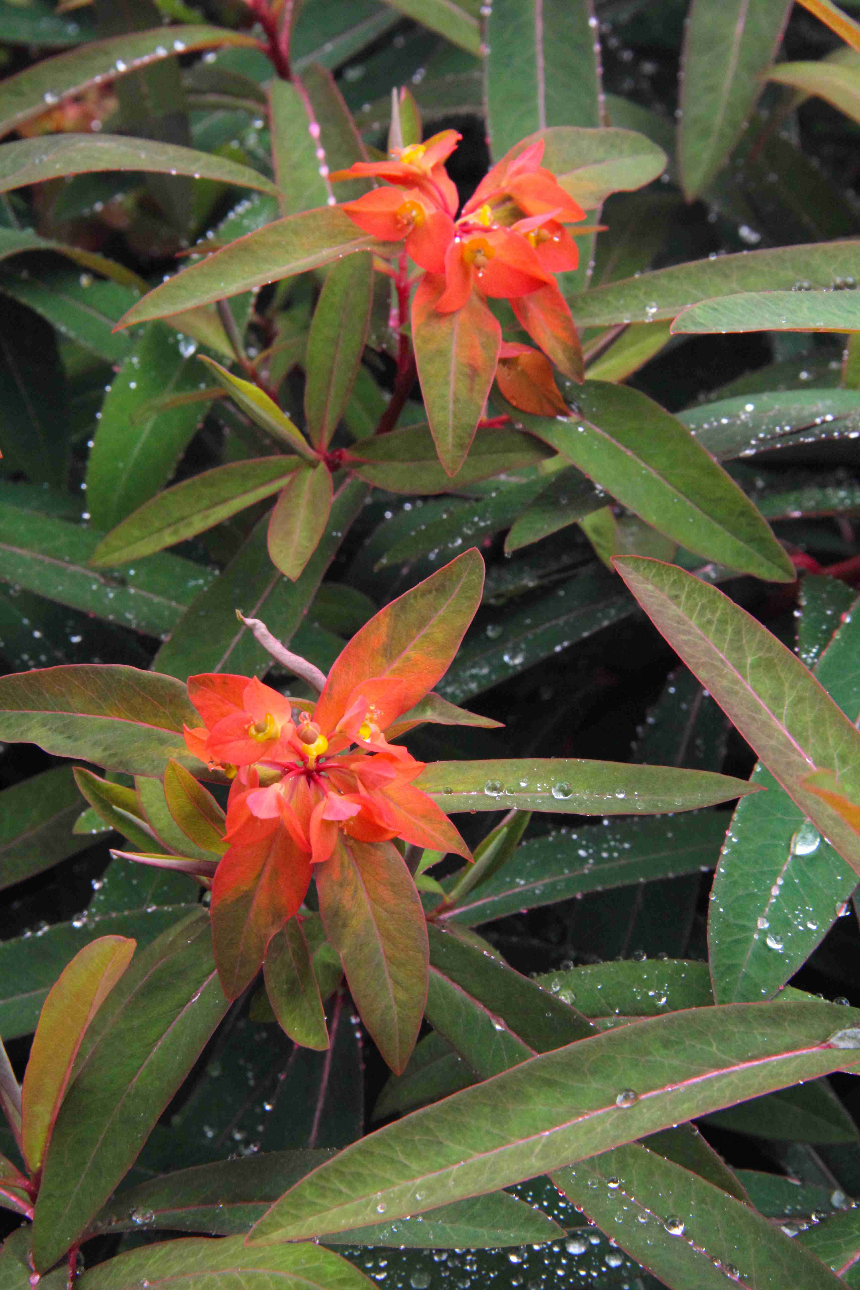
For less contrast, consider the tangerine hue on the Euphorbia griffithii bracts and flowers. Toned down from a pure orange, it makes the hue acceptable for those who prefer quieter renditions on their palette. Even the green is softer. The plant has two additional colors — yellow flower parts and burgundy stems — making five rich colors you may not have put together without seeing them. The Euphorbia blooms in spring, so choosing tangerine-hued tulips and late-blooming daffodils would tie into the palette and expand it further in the garden bed.
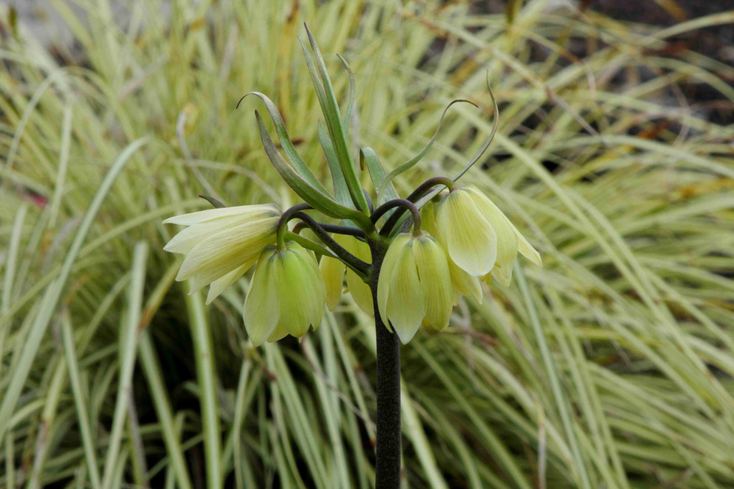
Gardens with only one or two colors, closely shaded, won’t visually limit it. Instead, they render a quiet elegance to the garden, while relying on texture to excite the eye. It’s uncanny how close in hue are Fritillaria raddeana flowers and Carex oshimenis ‘Everillo’ (sedge) foliage. In a garden, it becomes a place to rest the eye.
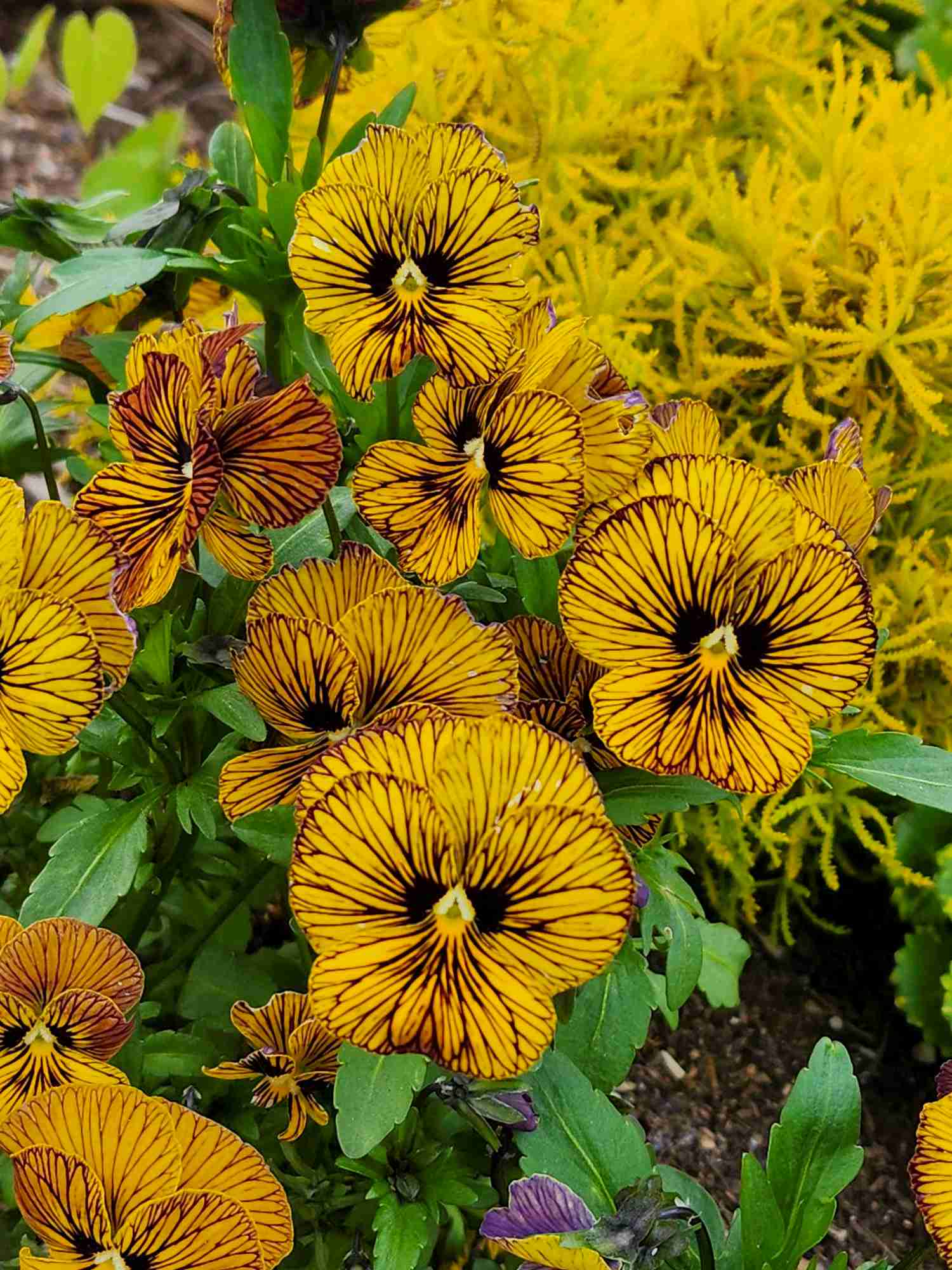
A little more exuberant color (and fragrance) comes from Viola ‘Tiger Eyes’ with its golden-yellow petals and deep burgundy lines, paired with the saturated gold foliage of Santolina virens ‘Lemon Fizz’ in the background.
An easy way to put your palette together is to visit your local nursery, where every color imaginable is represented in their flowers and foliage. Grab a cart and start choosing on plant of each you want to represent in your palette. Snap photos of your selections. If you’re truly inspired, hunt for matching paint chips at your local hardware store.